
This was my first full UI/UX project, where I explored the complete flow of an e-commerce experience. While it reflects my early learning stage, it laid the foundation for how I approach structure, responsiveness, and user-centered thinking today.
Project Overview
Martha is a fictional smartwatch e-commerce brand designed to deliver a calm, seamless shopping experience for modern professionals. This project focuses on clear navigation, intuitive product discovery, and thoughtful microinteractions, built to reflect a blend of tech and lifestyle appeal.
Introduction
This full product design project was created to simulate a real-world e-commerce flow from homepage to order confirmation. The goal: Build a refined, user-first platform tailored to women in their 40s, thoughtful shoppers who value clean aesthetics, quick access to product info, and a smooth checkout process.
The Problem
E-commerce experiences often feel cluttered and overwhelming, especially for busy users. This project aimed to design a clear, trustworthy, and visually calm shopping journey that encourages confident purchasing decisions.
Target User – Sophia
A 40-something team manager in Lagos with a doctoral degree. She's tech-aware, values good design, and takes time before making purchases. Her needs: fast product access, a wishlist, simple checkout, and helpful account tools.
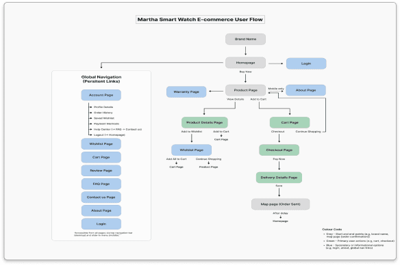
User Flow
Mapped from product discovery to checkout to ensure a seamless journey across devices. This guided the core structure of each feature.
Design Goals
Minimal, calming interface with a premium edge
Clear flow from homepage to confirmation
Integrated account features (wishlist, order history)
Thoughtful use of motion and microinteractions
Fully responsive design
Pages & Features
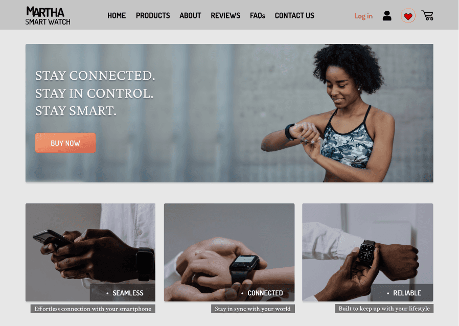
Homepage: Strong hero section with brand messaging and value propositions (Seamless, Connected, Reliable).
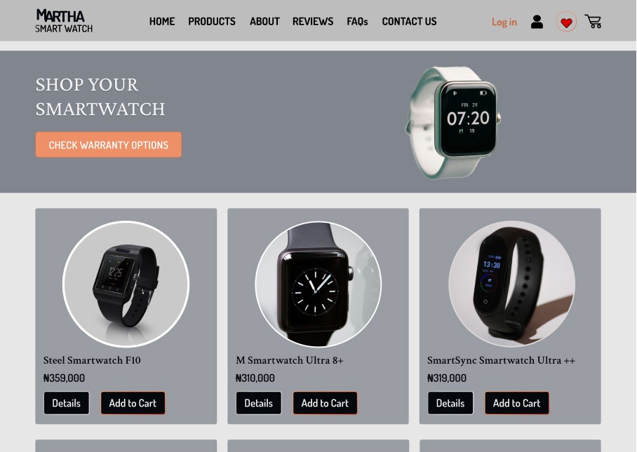
Products Page: Grid layout with name, price, “Details” and “Add to Cart” options for efficient browsing.
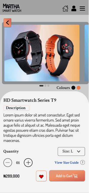
Product Details Page: Image switchers, size & quantity selectors, wishlist, and clear CTAs , designed for confident decision-making.
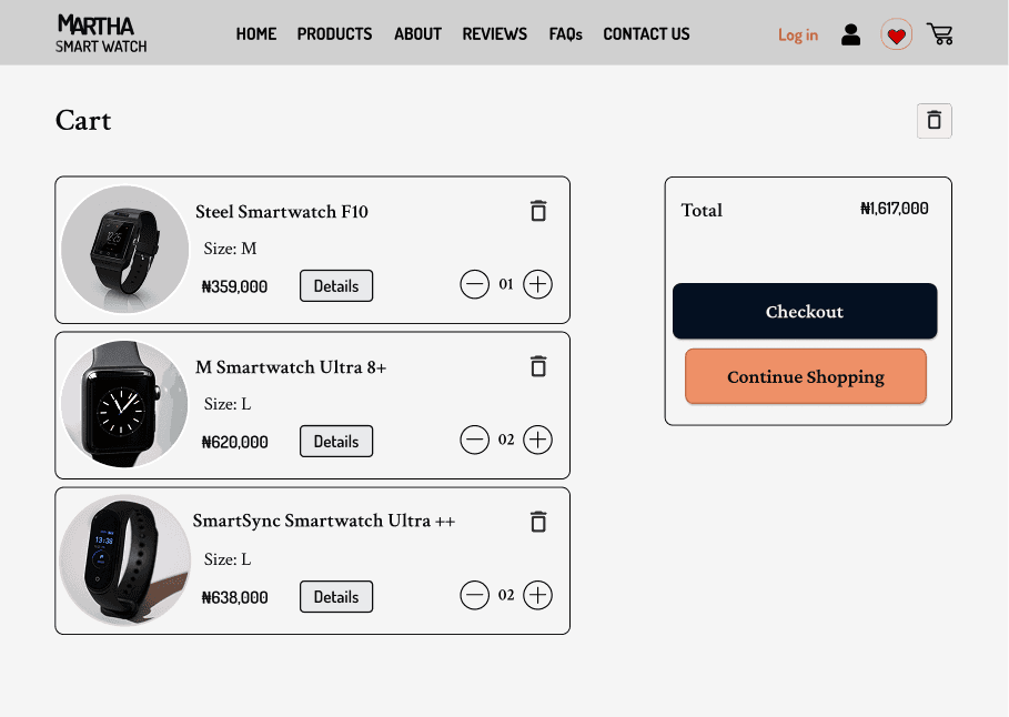
Cart Page: Organized item summary with edit/remove options before checkout.
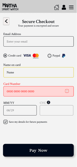
Checkout Page: Minimal, distraction-free form layout for smoother payment flow.
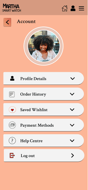
Account Page: Profile details, wishlist, payment info, and help center, all in one place.
Interactive Design Highlights
Hover States: All main buttons feature smooth hover effects, especially on “Add to Cart.”
Microinteractions: Success ticks, subtle animations, and feedback after key actions (e.g., saving info or confirming purchase).
Visual Style
Colors: Deep blues and greys for trust, whites for clarity, and orange for accents/action.
Typography:
Crimson Text for headers & navigation
Dosis for product info & UI text
Crimson Pro for primary buttons
Responsive font sizes optimized across screens
Challenges & Solutions
Challenge: Designing for a mature audience
Solution: Prioritized space, clarity, and calm color schemes
Challenge: Visual inconsistency between cart & wishlist
Solution: Unified both to maintain cohesion and reduce user friction
Outcome
Delivered a polished, responsive e-commerce experience supporting smooth navigation from browse → checkout.
Designed a cohesive visual system with premium aesthetics and clear hierarchy, improving buyer confidence.
What I Learned
Personas deeply influence product decisions
Microinteractions enhance user trust
Visual cohesion = emotional reassurance
Even subtle motion or font tweaks can shift the user experience

