
What is Alpha TV?
Alpha TV is a digital streaming platform that lets users watch sermons, movies, series, and live TV across devices - web, mobile, TV, and even through a dedicated Alpha TV Stick.
The platform had strong content and audience reach, but the experience felt dated compared to modern streaming standards. Navigation was inconsistent, onboarding and payments added friction, card sizes weren’t optimized, and helper pages lacked hierarchy.
The redesign aimed to:
Improve onboarding and payment flows so new users could start streaming quickly.
Build a consistent component system across web, mobile, and TV.
Modernize the homepage and landing page for better content discovery.
Redesign the media player for both desktop and mobile.
Ensure layouts were responsive and accessible.
Update helper pages (Contact Us, FAQ, Privacy Policy, Terms of Use) with clearer hierarchy and usability.
In short, the goal was to make Alpha TV feel intuitive, consistent, and streaming-standard ready.
Process
Research & Audit
As the product designer on the project, I worked end-to-end across research, visual direction, and interaction design. I reviewed the existing Alpha TV product and benchmarked it against competitors like Netflix, Disney+, and Prime Video.
Key issues included:
Card sizing: Oversized and inconsistent, making browsing exhausting.
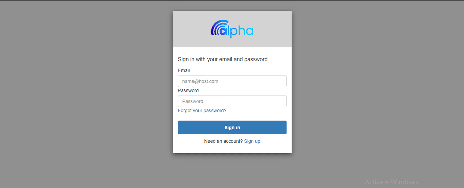
Onboarding: OTP sign-in had friction and unclear recovery paths.
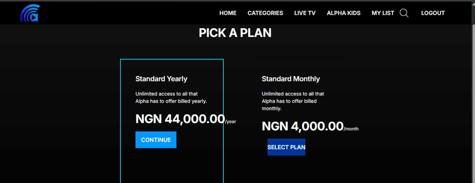
Subscription & Payment: Layouts made plan comparison harder, with poorly sized buttons (text overflow) and misaligned hover states that broke visual consistency.
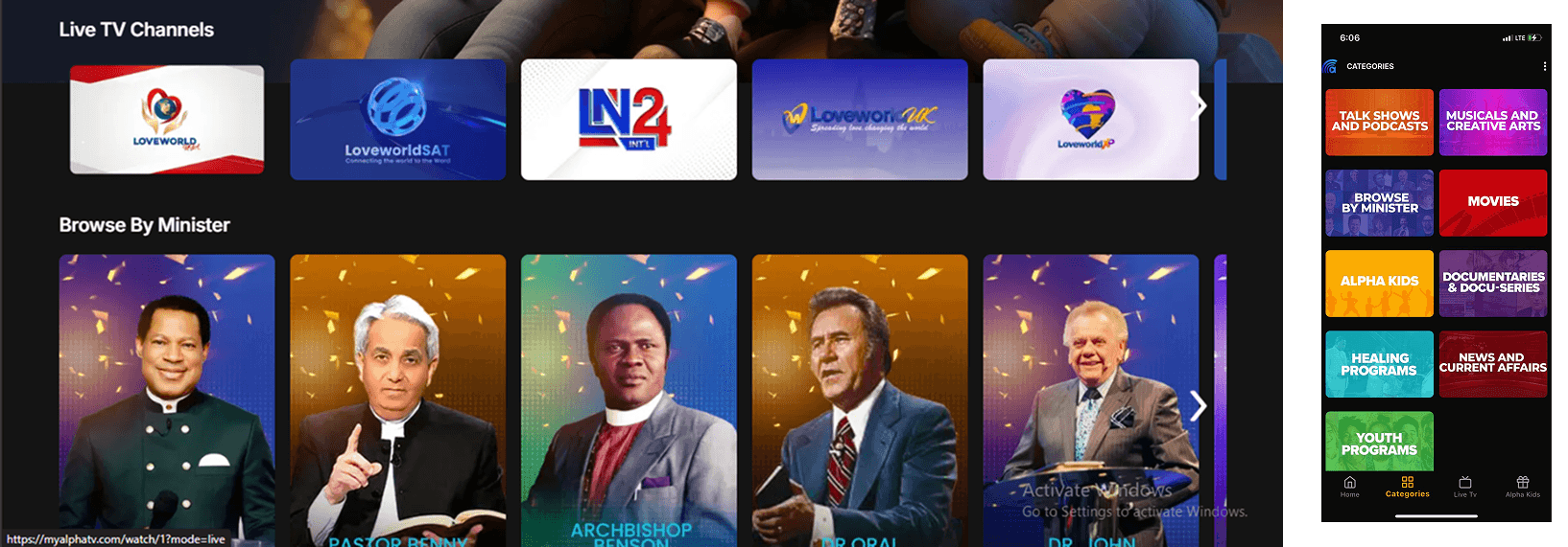
Homepage: Outdated layout and weak hierarchy, further amplified by inconsistent card sizing.
Landing Page: Weak hierarchy and unclear section flow.
Helper Pages: Informational pages lacked hierarchy, structure, and some critical details.

In short, the goal was to make Alpha TV feel intuitive, consistent, and streaming-standard ready.
Building a Component System
To ensure consistency, I created reusable components which included:
Buttons with multiple states
Input forms
Standard and preview cards
Carousels for horizontal browsing
FAQ and info modules
Video player controls and overlays
This foundation ensured reusability and design consistency across all platforms.
What I Redesigned
Core User Flows
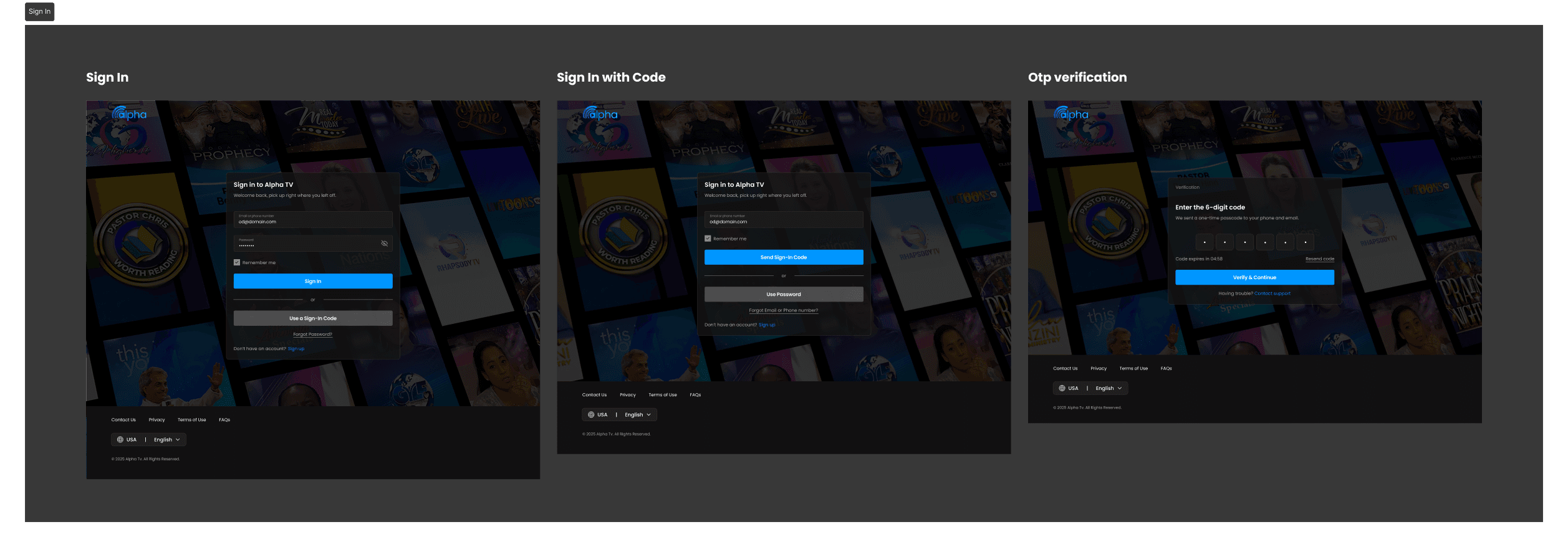
Sign-In: Streamlined entry with standard login, sign-in with code and OTP verificatiom
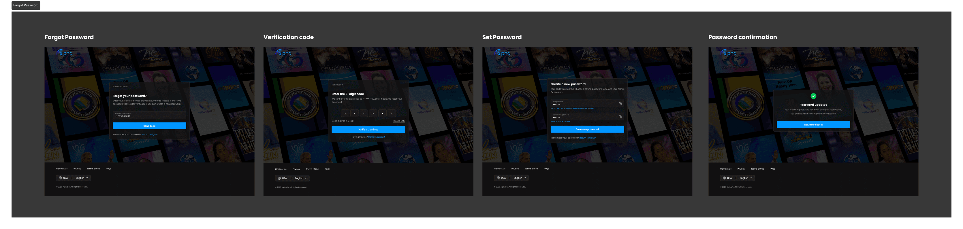
Recovery Flow: Clearer OTP recovery and password reset with confirmation states.
Subscription & Payment: Step-based flow where account creation, plan selection, and payment are unified into 3 stages. Voucher redemption included.
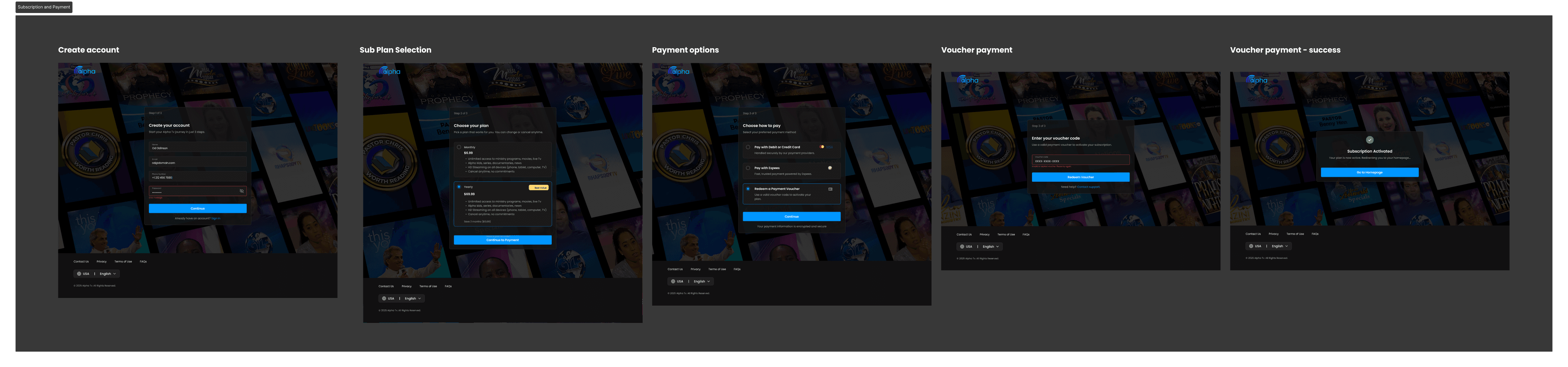
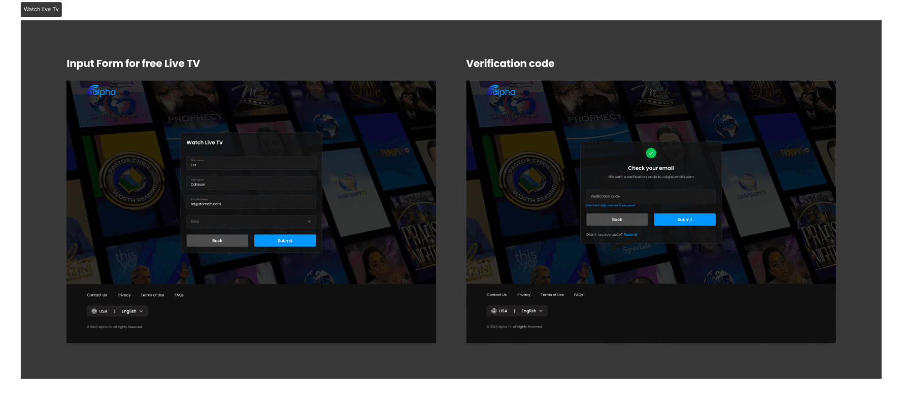
Special Access: A dedicated form for free live TV access.
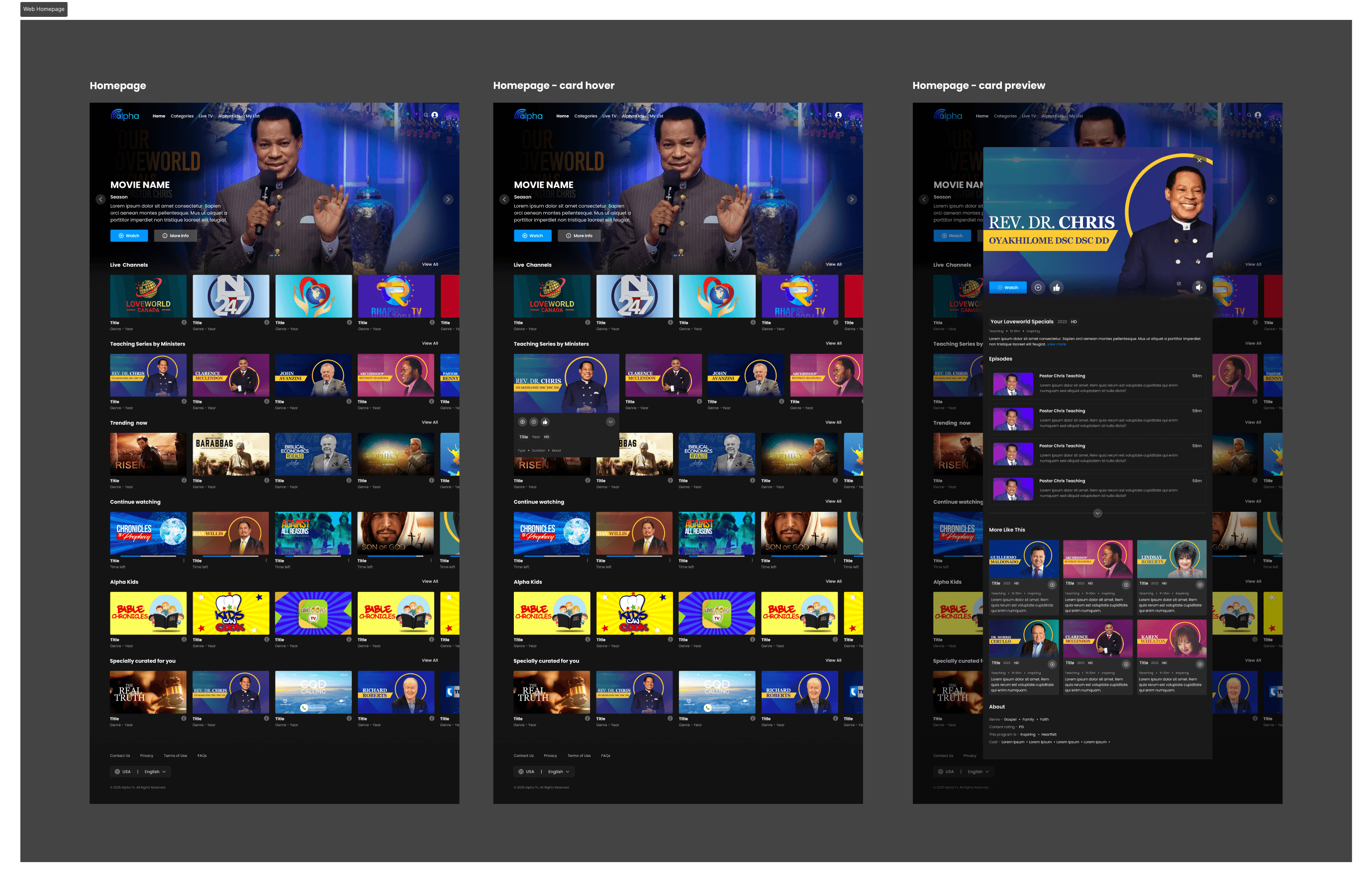
Landing Page (Web) & Homepage (Web, Mobile & TV)
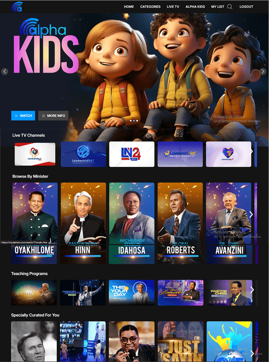
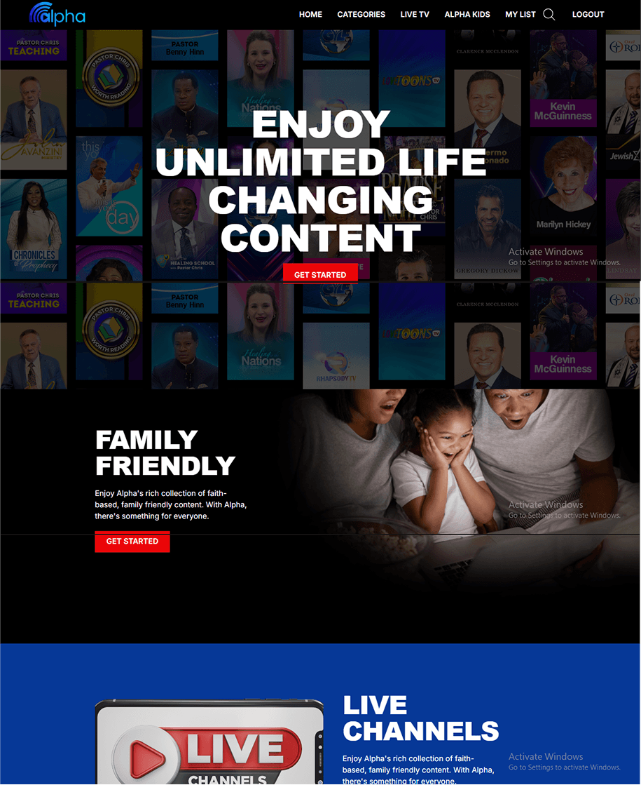
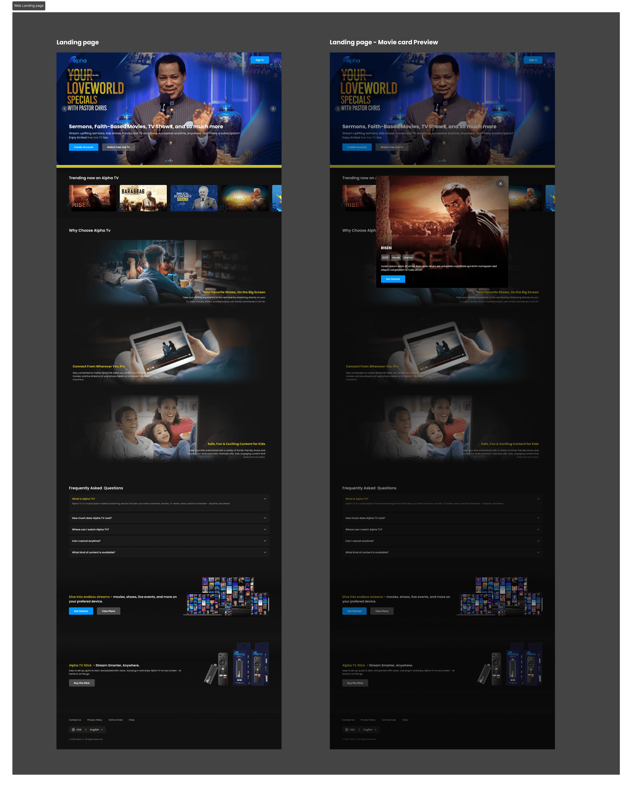
Landing Page (Web): Rebuilt hero, trending section, and content blocks into a modern, structured flow with clearer hierarchy.
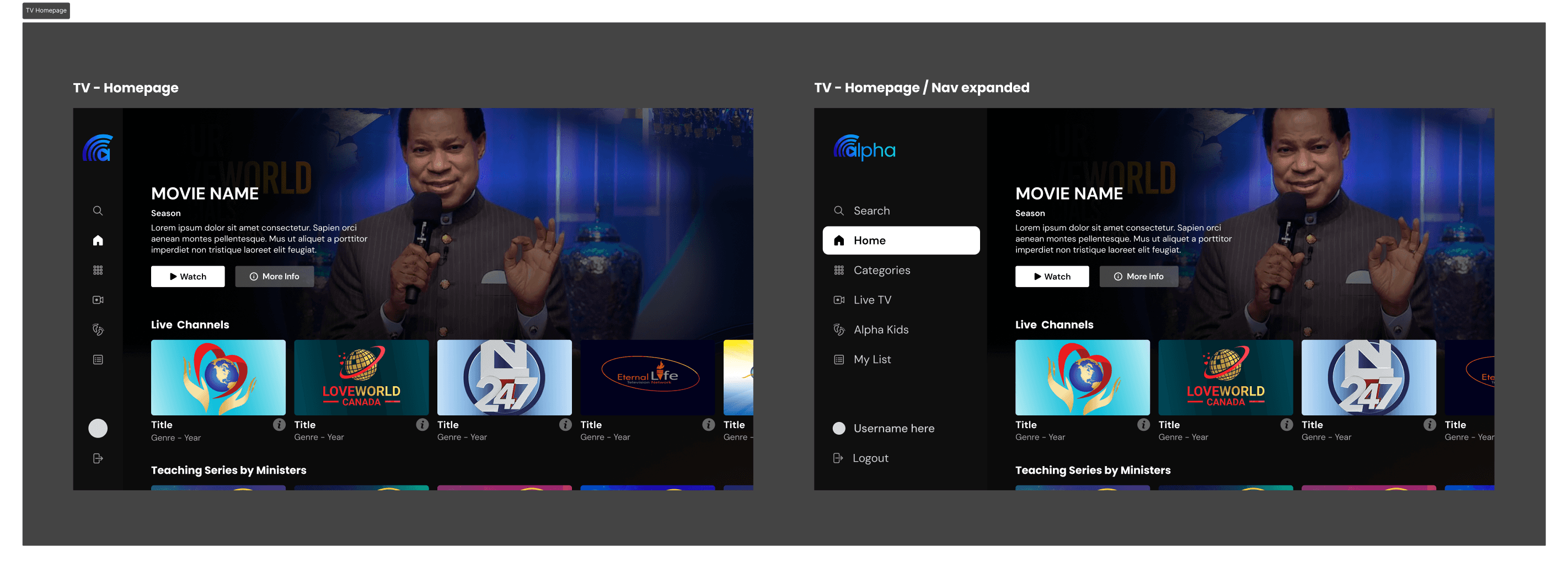
Homepage (TV): Redesigned with consistent 16:9 card ratios and clear visual indicators (focus states with a blue highlight) to make remote navigation smoother and content discovery easier on larger screens.
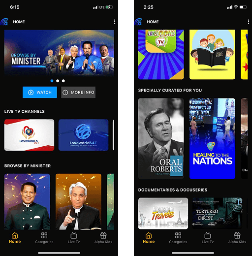
Homepage (Web): Cards resized to a consistent 16:9 ratio, showing 4.5 per carousel. The layout was streamlined to reduce visual clutter and improve content discovery, making browsing feel lighter and more modern.
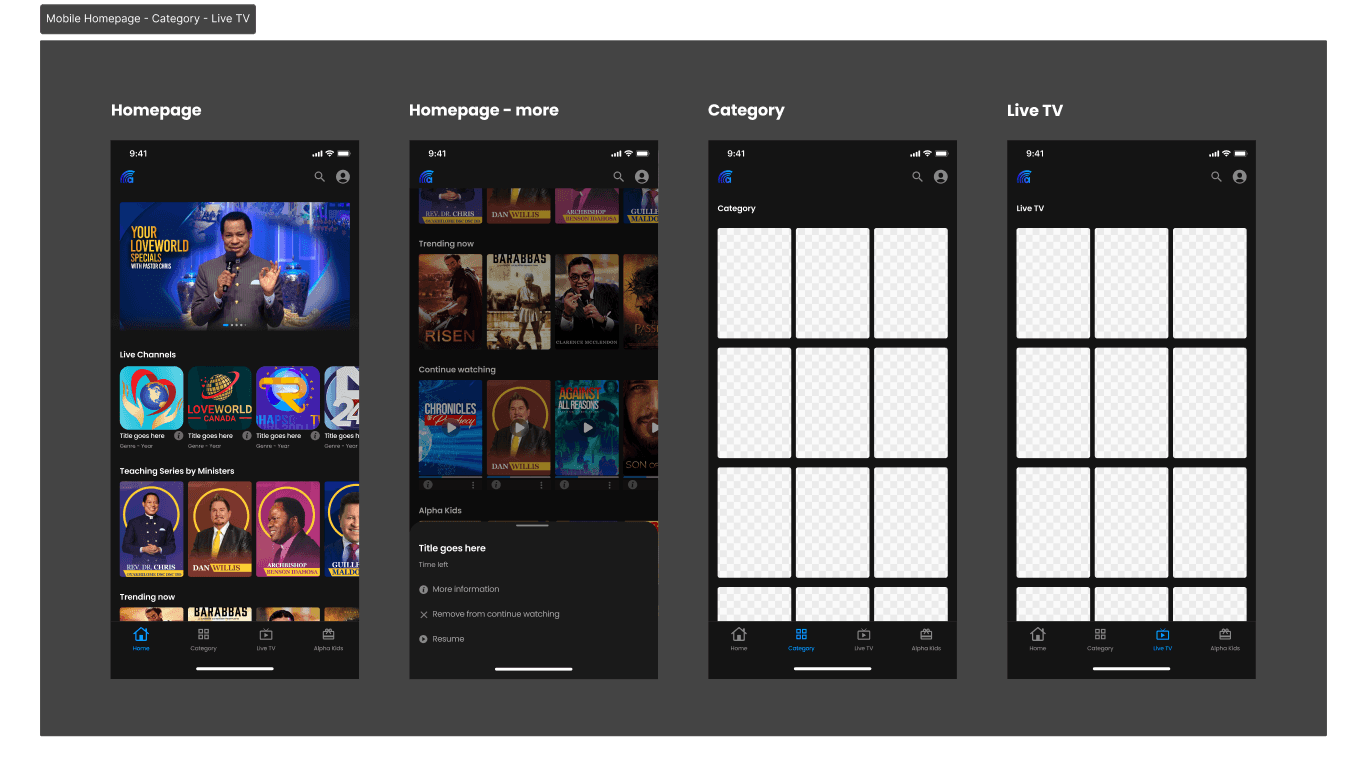
Homepage (Mobile): Poster cards were resized to a 2:3 ratio, showing 3.5 per row, while Category and Live TV sections were redesigned to display 3 cards per row with fixed layouts across all screen widths. The overall browsing flow became more structured, making content discovery and navigation smoother across devices.
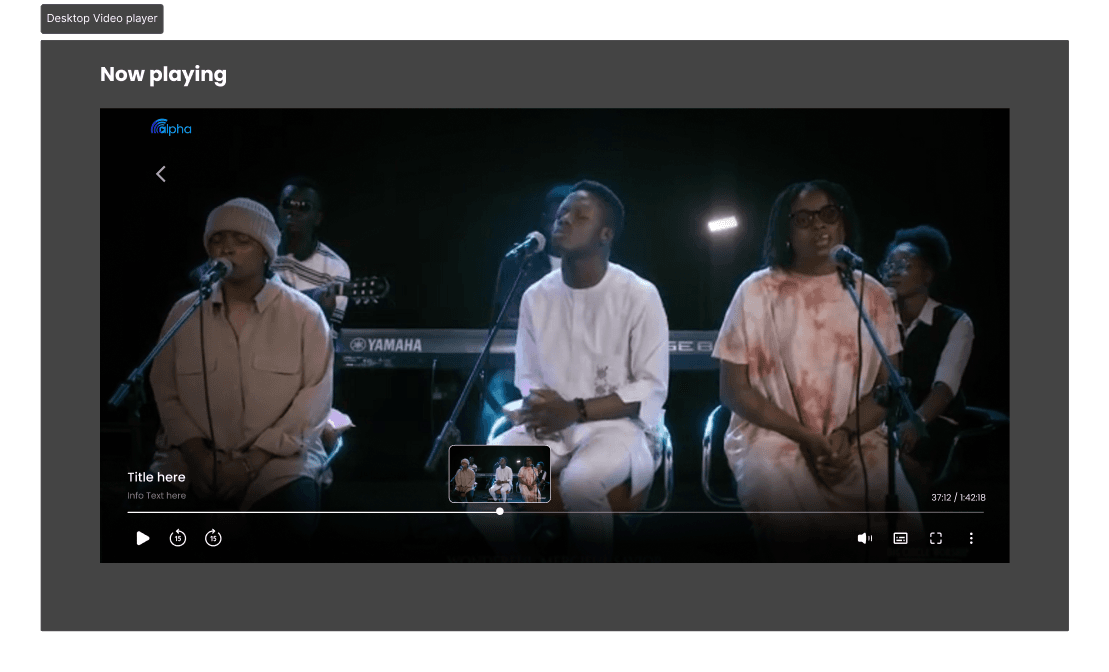
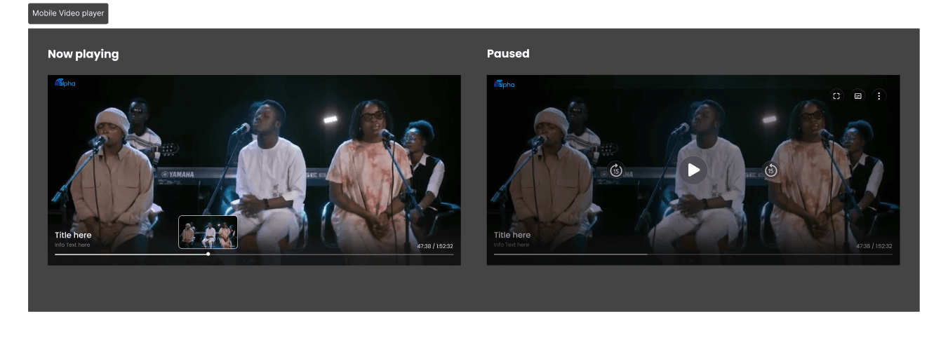
Media Player
Redesigned for both desktop (hover + click controls) and mobile (touch-first interactions).
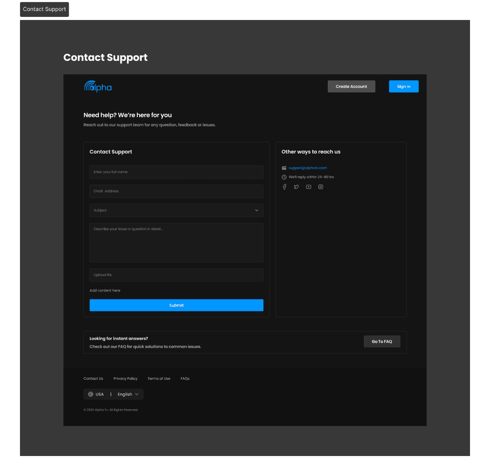
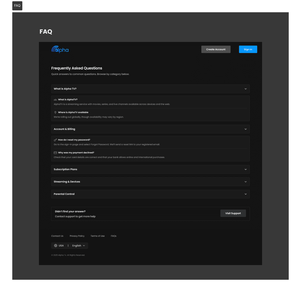
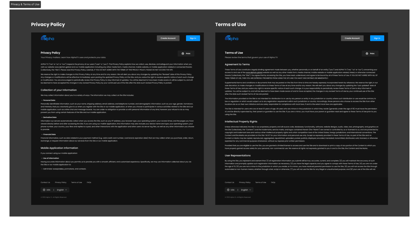
Helper Pages
Contact Us: Added a functional input form for faster support.
FAQ: Redesigned into expandable, user-friendly modules.
Privacy Policy & Terms: Improved hierarchy and readability for professionalism.
Before & After
✅Before: Browsing felt heavy due to oversized cards, weak hierarchy, and unclear flows. Onboarding, payments, and recovery created friction, while helper pages were hard to navigate.
✅ After: The experience shifted toward a structured, consistent, and professional streaming standard. Pages became easier to scan, flows more intuitive, and support content more usable across web, mobile, and TV.
Solution & Outcomes
Delivered a unified component system across web, mobile, and TV, improving design consistency and development speed.
Redesigned onboarding, recovery, and subscription flows, reducing friction and supporting higher activation rates.
Improved homepage, category layouts, and content cards to enhance discoverability and strengthen visual hierarchy.
Upgraded the video-player experience with intuitive touch and remote-based interactions for cross-device ease.
Refreshed landing and support pages with clearer structure, reducing confusion and aligning with streaming standards.
Validated designs through user testing and stakeholder reviews, confirming stronger cross-platform usability and reinforcing stakeholder confidence by resolving previously flagged pain points.

